


How to choose colors for living room zones: This is how visual room division works
An open living room offers many possibilities but also challenges. With the right color selection, you can delineate different areas like the sofa corner, dining space, or home office without needing to put up walls. Here’s how to proceed step by step.
1. Basic principle: Color harmony in the room
First, choose a dominant color for the entire room (e.g., a warm beige or a soft gray). This forms the foundation on which you can build. The zone colors should match – either from the same color family (monochromatic) or as a contrast (complementary).
2. Define zones: Which areas do you want to emphasize?
Typical zones in the living room are: seating area (couch, armchair), dining area (table, chairs), reading nook (armchair, lamp), and possibly a work area. Consider which zones you want to highlight – the accent color draws attention.
3. Use color strategically: Walls, furniture, or accessories?
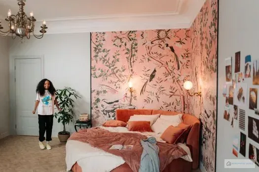
- Wall color: Paint a single wall behind the couch or dining table in an accent color. This visually separates the zone.
- Furniture: A colored sofa or a colorful rug defines the area without wall color.
- Accessories: Pillows, curtains, or picture frames in zone colors work subtly and flexibly.
4. Consider color temperature: Warm vs. cool
Warm tones (red, orange, yellow) feel inviting and suit cozy seating areas. Cool tones (blue, green) promote concentration – ideal for reading nooks or home offices. Harmony arises when you don’t mix temperatures wildly but choose a basic direction.
5. Practical examples of color combinations
Scandinavian bright: White or light gray base, pastel blue accents at the dining space, soft pink in the seating area. Modern high-contrast: Anthracite on the sofa wall, mustard yellow for the dining table, white accessories. Natural earthy: Beige as base color, terracotta for the reading nook, olive green for plants and textiles.
6. Design color transitions gently
Avoid hard edges. Use color gradients through furniture pieces or rugs that incorporate the colors. A consistent ceiling color (e.g., white) ties the zones together.
7. Play with light
The effect of zone colors changes depending on daylight and artificial lighting. Test color samples under different lighting conditions. Warm dimmers in the zones enhance the color mood.
Conclusion
Courage to use color pays off – but plan the zone colors consciously based on the room’s function. With these tips, you’ll create a living room that both looks cohesive and gives each area its own character. Experiment with color cards and let your personal style guide you.