


Introduction: Using Retro Colors Smartly
Retro colors are experiencing a revival – especially in small rooms, where they can create character and warmth. However, many hesitate to use vibrant tones for fear of visual overload. With the right techniques, you can create impressive accents even in a few square meters. This FAQ answers the most common questions about mixing retro colors in small rooms.
Why Retro Colors Work in Small Rooms
Retro colors are often warm, saturated, and lively – qualities that make small rooms feel cozier. Through clever combinations, they can even make spaces appear larger. Light pastel shades reflect light, while strong accents create depth. The key is a balanced ratio between color and quiet zones.
Overview of the Most Important Retro Color Palettes
| Era | Color Palette | Effect |
|---|---|---|
| 1950s | Pastel yellow, mint green, baby blue, old rose | Light, fresh, playful |
| 1960s | Orange, avocado, brown, golden yellow | Warm, earthy, optimistic |
| 1970s | Mustard yellow, olive green, terracotta, chestnut brown | Nostalgic, warm, mature |
Which Retro Colors Are Suitable for Small Rooms?
In general, light retro tones are particularly good because they make rooms appear larger. However, strong colors can serve as accent points – without overwhelming the space.
Light vs. Strong Retro Tones

Light pastel tones like mint green, delicate yellow, or light old rose visually stretch the room and feel airy. Strong colors like mustard yellow or avocado green should be used sparingly – for example, on a single wall or in decorative elements. Rule of thumb: The smaller the room, the more light surfaces and the fewer saturated colors.
Pastel Colors of the 1950s and 1960s
The pastel palette of the 1950s and 1960s is ideal for small rooms. For example, a soft rose on the walls, combined with cream-colored furniture and mint green accessories, creates a fresh, spacious atmosphere. These colors reflect a lot of light and make walls recede.
How Do I Mix Retro Colors Correctly?
A harmonious blending concept is key. Without a plan, a room can quickly appear chaotic. Rely on color theory and proven rules.
Color Contrasts and Harmonies

Complementary colors like blue-orange or green-red create tension but should be dosed in small rooms. Analogous colors (e.g., different shades of yellow and orange) or monochrome combinations work better, creating a calm effect. A popular retro look is combining mustard yellow, olive green, and terracotta.
Applying the 60-30-10 Rule
This rule creates balanced color proportions: 60% dominant color (e.g., light wall color), 30% secondary color (furniture), 10% accent color (accessories). In a small room, the dominant color could be a light pastel, the secondary color a stronger tone like avocado, and accents in orange or gold.
How Do I Set Color Accents Without Overloading?
Accents are the salt in the soup – too much spoils the flavor. Focus on a few targeted color islands.
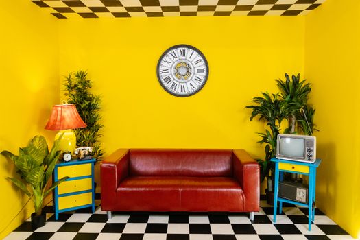
Colored Wall Surfaces and Accent Walls
A single wall in a strong retro tone (e.g., terracotta or mustard yellow) becomes a focal point. Paint the other walls in a light, muted white or a delicate pastel. This keeps the room open while giving it a strong color focus. A niche or staircase area is also suitable.
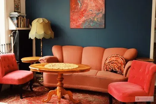
Accessories and Textiles as Color Splashes
Cushions, blankets, rugs, curtains, and picture frames are ideal carriers for strong retro colors. They are easy to change and bring variety. A strategically placed retro armchair in orange or a colorful rug with a 1970s pattern set accents without overloading the room.
What Optical Tricks Are There for Small Rooms?

Colors alone can transform rooms – combined with design tricks, the potential is fully exploited.
Color Gradients and Horizontal Lines
Color gradients (ombré) on walls draw the eye upward and make the ceiling appear higher. Horizontal stripes in contrasting colors visually widen the room – ideal for narrow, long rooms. A retro trick: draw a thick, colored stripe at mid-wall height as a horizontal line.
Using Mirrors and Light Reflection
Mirrors reflect light and color, opening up the room. Place mirrors opposite windows or colored walls. Glossy surfaces like high-gloss paint or metal also reflect – a retro cabinet in high-gloss mint green can work wonders. Opt for warm, indirect light to make the colors even cozier.
Which Retro Decor Products Help with Implementation?
The right products greatly facilitate color design. From furniture to wall coverings to small accessories, there are many options.
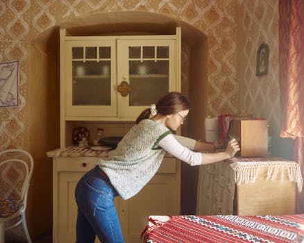
Colored Furniture Pieces in Retro Design
A pastel-colored cabinet, an avocado-green armchair, or a table with rounded shapes – furniture in the style of the 1950s to 1970s are real highlights. Combine such a statement piece with neutral rooms to set the desired color accent. Chests of drawers, sideboards, and shelves in retro colors are also available.
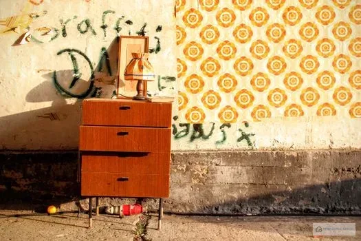
Wallpapers and Wall Art with Retro Motifs
Retro wallpapers with geometric patterns, floral, or psychedelic designs give small rooms character. They are perfect for an accent wall. Wall art and posters in retro colors – e.g., with abstract shapes or retro advertising – bring the look into the room without much effort. Combine the motifs with the colors of your interior for a cohesive overall picture.